Commuting to Northeastern
This chart was for an information design studio class. The concept was to analyze and visualize data about our classmates and larger community. This chart seeks to find possible correlations between available types of public transportation, distance from Northeastern and median household income.
Tech
- JavaScript
- D3.js
- Affinity Publisher
- Adobe Illustrator
Process
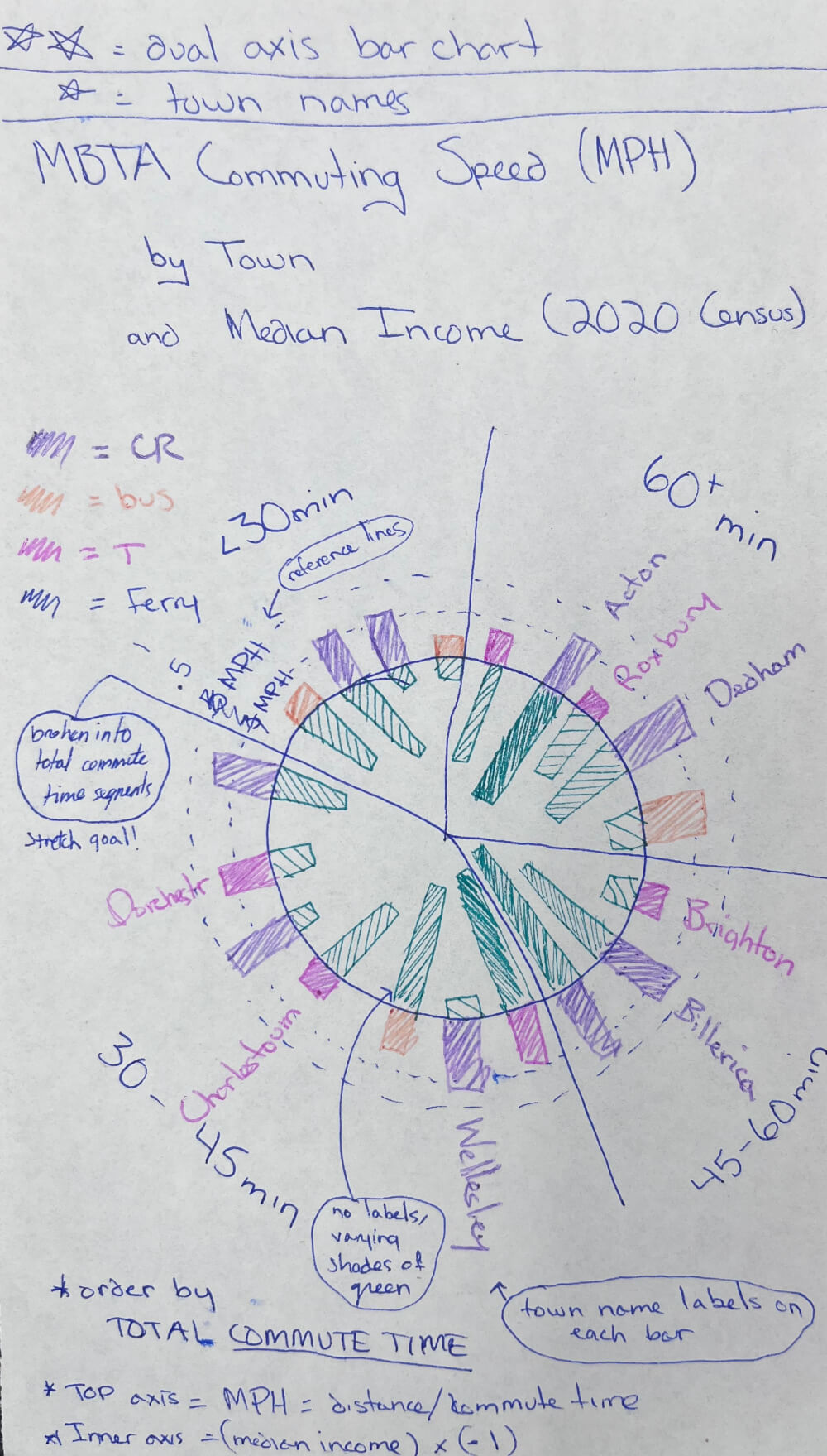
The first question for me was, "how do I show this data?" There are two major datasets here: MBTA data and income data. I drew up a dual axis circular bar chart by hand and realized I didn't have a clue how to make it. Not many tools come with pre-packaged tools for circular bar charts, let alone dual axis ones. Tableau? Illustrator? Excel?
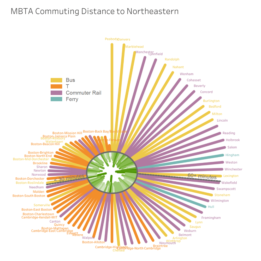
This was my first attempt using Tableau. A 40-minute tutorial from YouTube and my own math and Tableau skills were able to get me to this fun oval chart. The issue is, noen of these bars have a high level of discriminability. Labeling was also difficult to finagle in Tableau.
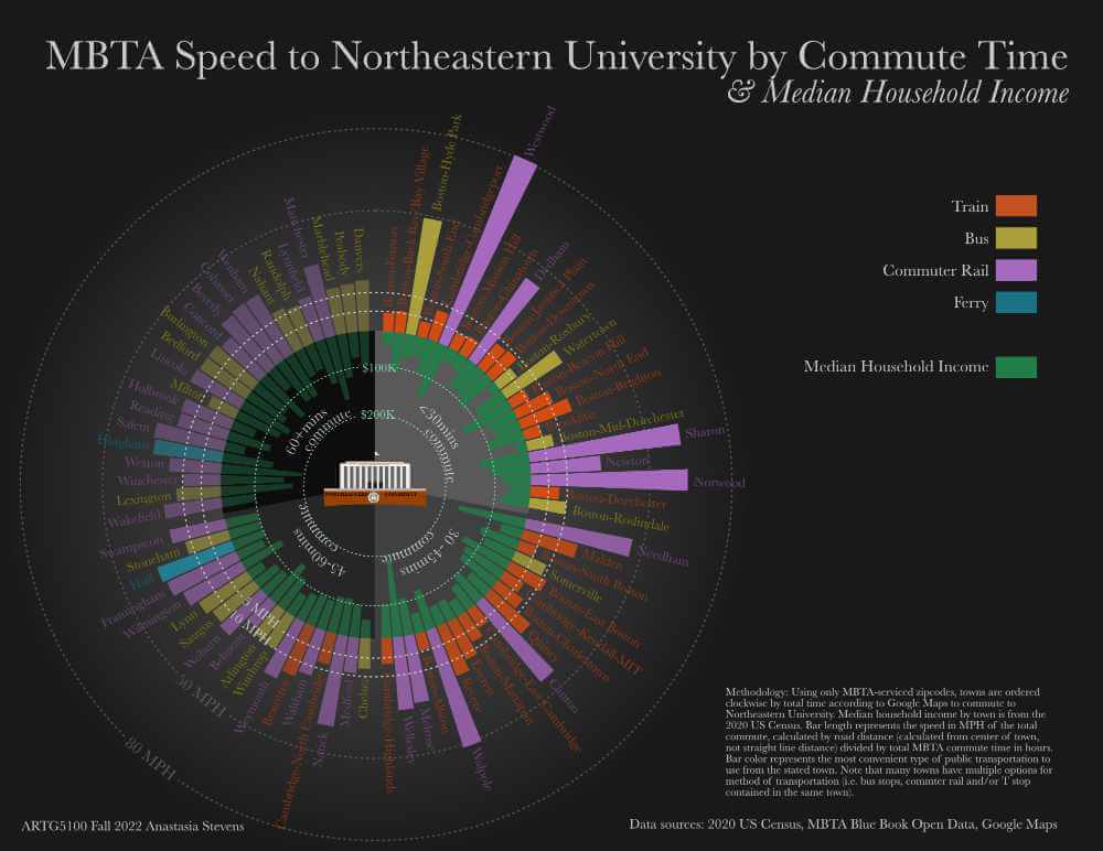
Enlisting the help of the D3 Graph Gallery's excellent chart library and with no small amount of assistance de-bugging from a friend, I was able to produce a much cleaner, more tunable and distinct design. I also changed the outer bars to represent speed in MPH instead of total commute time as there is no real significance in the difference between a 60-minute commute and a 51-minute one.
Final steps involved bringing the SVG into Affinity Publisher and adding axes and labels. This chart was sized and formatted for print.
Data
MBTA data is from the T's Blue Book Open Portal (https://mbta-massdot.opendata.arcgis.com) Zip codes and median household income is from the 2020 US Census. Dual axis bar chart tutorial from the D3 Graph Gallery & Yan Holtz (https://d3-graph-gallery.com/circular_barplot.html) Methodology: Using only MBTA-serviced zipcodes, towns are ordered clockwise by total time according to Google Maps to commute to Northeastern University. Median household income by town is from the 2020 US Census. Bar length represents the speed in MPH of the total commute, calculated by road distance (calculated from center of town, not straight line distance) divided by total MBTA commute time in hours. Bar color represents the most convenient type of public transportation to use from the stated town. Note that many towns have multiple options for method of transportation (i.e. bus stops. commter rail and/or T stop contained in the come town'